It seems only yesterday when Nothing announced they would be coming out with their own smartphone. Fast-forward three years and the London-based company is gearing up to release Nothing OS 3.0 based on Android 15. I got my hands on the Nothing OS 3.0 beta, and after over a day of use on the Nothing Phone (2a), here’s my initial impressions.
All New Quick Settings
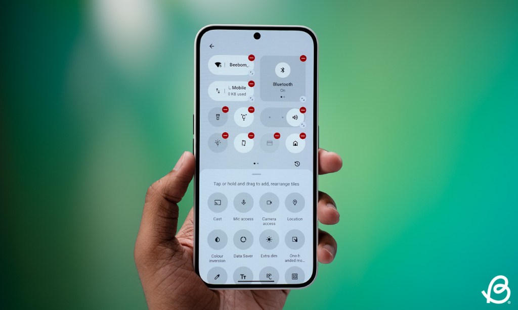
The quick settings panel has received a major makeover in Nothing OS 3.0. It now has circular and more dynamic toggles in place of those giant pills. Not only does this look more modern, but also aesthetically pleasing. These toggles are resizable, so you can expand them to view more information if needed.
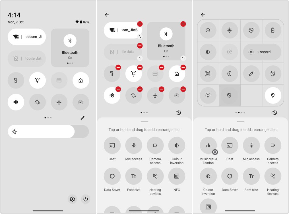
For example, the expanded Bluetooth toggle can show both connected and saved devices. It gives you more control over the layout of your quick setting than before. You can now arrange it with more toggles in one page up to 16, double the amount you could fit before. Nothing OS 3.0 also addressed one of my gripes by offering a separate data toggle. So now I don’t have to go to the Wi-Fi option to turn off data.
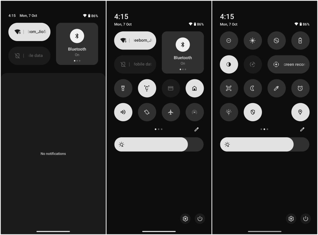
I also love that the brightness slider has shifted to the bottom of the toggles, and increased in thickness. This makes it easy to grab and slide with one hand, as opposed to what it used to be. It also includes the auto brightness toggle that the community has requested for a while now. But sadly, the brightness slider is still missing when you collapse quick settings. I don’t know when they will change this.
A “Smarter” App Drawer
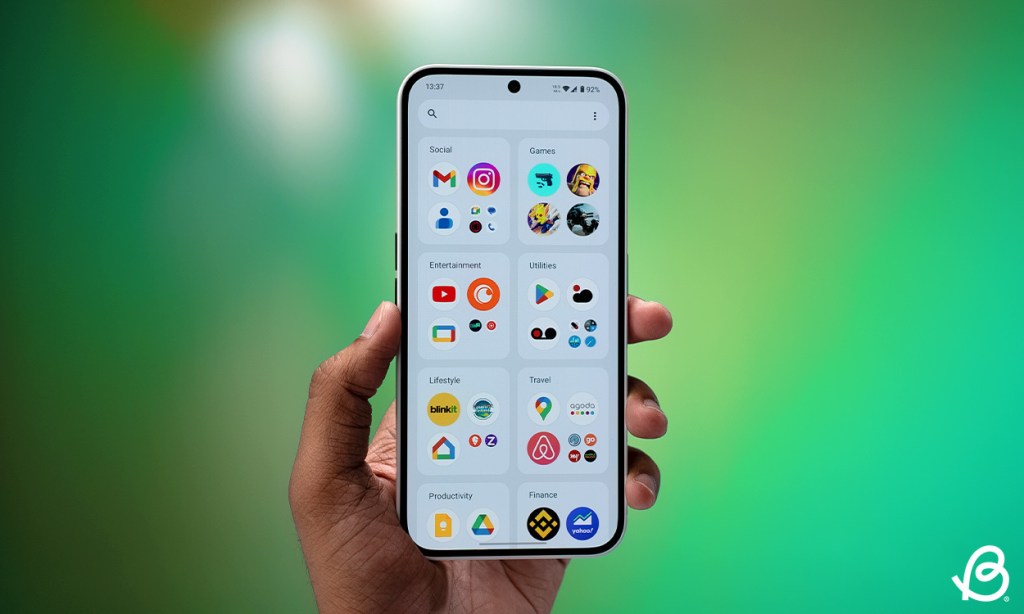
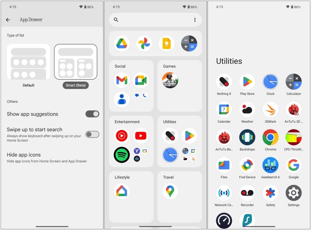
The home screen launcher in the Nothing OS 3.0 includes a new “Smart” app drawer. The “smart” part comes from the new layout, which automatically sorts your apps into different folders based on their functions. iPhone users will be quick to point out that this has a striking resemblance to the App Library in iOS. And after using it, I can say it’s pretty much the same thing.
You cannot create new folders, or add apps from one folder to another. I have two email apps, each in a different category for some reason, and I can’t do anything about it. But since the Smart app drawer has a “Beta” label, I’ll expect the company to add customization options later down the line.
There’s also an app pinning option, which allows you to pin your frequently used apps to the top of the drawer. This has become one of my favorite features of Nothing OS 3.0.
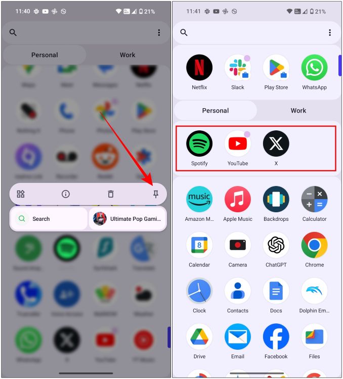
This lets me pin my preferred apps, removing any guesswork from app suggestions. It’s a small but smart addition, and I can’t believe other OEMs didn’t come up with it before.
Lock Screen Customizations
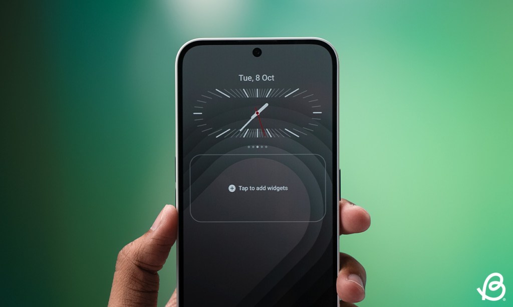
Nothing OS 3.0 brings changes both inside and out. So the lock screen now features several customization options. Now, don’t get me wrong. I like the current lock screen editing options in the OS, but I am certainly not a fan of how you have to dig into settings to make changes. This update fixes that, as you can now long press on the lock screen to customize.
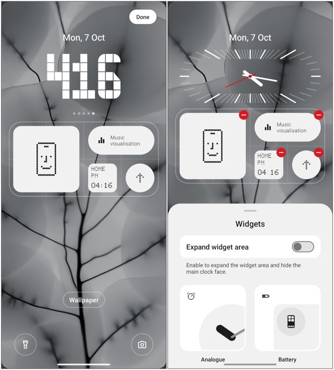
There are 5 new clock faces, each with a different font and design. However, I would have appreciated additional analog clock options, as there is just one right now. You can now enlarge the widget area to hide the clock faces. This allows you to add additional widgets to the lock screen, making it as information-dense as possible.
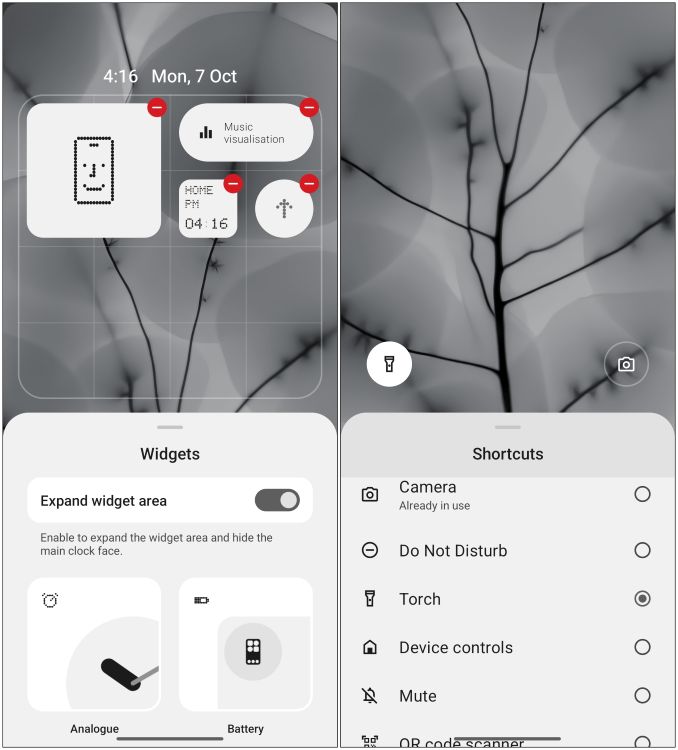
This is another change I like, as you had to be picky about which widgets I added given the limited space. You can also customize the left and right toggles directly from the lock screen.
Fresh Look for Settings App
The Settings page has also received a new look. The menus and options are now segmented. This makes it easier on the eyes and also helps you easily get to the settings you are looking for. Long-time Android users can immediately tell that this looks similar to how the settings page used to look back in Android 7.0 Nougat.
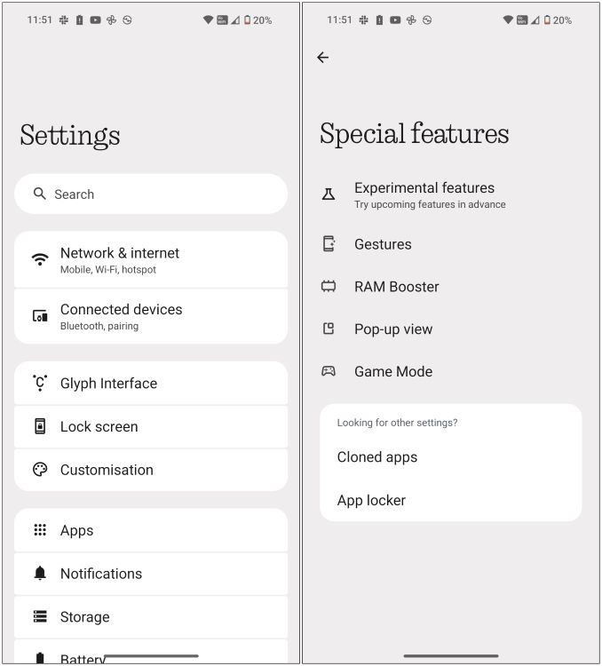
There is also a new option – “Special features” which houses RAM Booster, Game Mode, Pop-Up view, and Experimental features options. Have to say that I am seeing a lot of clever decisions on the Nothing OS design team. But there is another significant change in the Nothing OS 3.0 that some of you might like, and some may not.
A Departure from N-Dot Font
While using the Nothing OS 3.0, I quickly noticed that there was a visible absence of Nothing’s iconic N-dot font throughout the UI. From the setup screen to the settings page, the N-dot font has been completely wiped off the OS. Coming from the older version, this change felt a little odd, as the N-dot font ties so closely to Nothing OS’ identity. But it’s a deliberate decision from the company, as they decided to switch to a stylistic sans-serif font.
The reason for this is improved readability. Even though N-dot is iconic to Nothing and matches widgets, app icons, and clock faces, it is difficult to read at some spots and appears out of place with the rest of the interface, at least for me. The new font is user-friendly and complements the menus and UI choices. I got used to it quickly, and I don’t want to go back to the previous font.
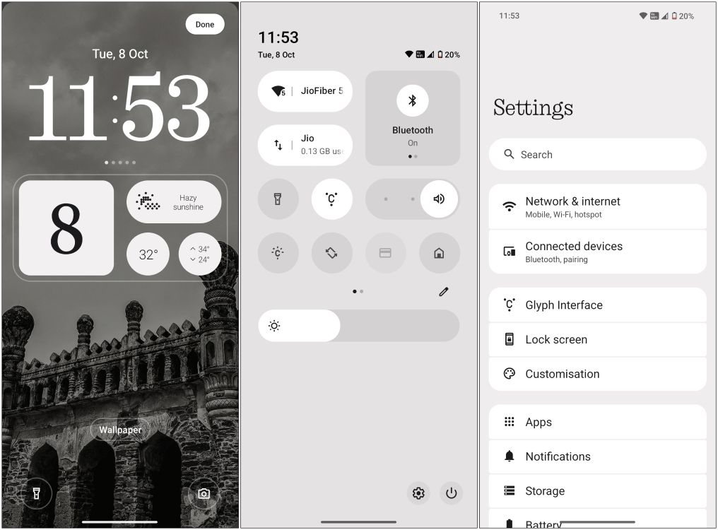
Now, it’s not like the company is completely moving away from dot matrix. Instead, they are being more creative with how they use it. They are introducing a new Interactive Dot Matrix animation engine in the UI as well as apps and widgets. We saw a glimpse of it during the Nothing OS 3.0 announcement along with the fingerprint unlock animation and the updated weather app. While I don’t see the weather app in this build, I can say that the fingerprint animation is pretty neat.
Other Notable Changes
Besides all these major overhauls, Nothing OS 3.0 also features some other changes in the interface. The widgets page is now divided into two sections, one with larger folders for Nothing exclusive widgets and the other page for third-party apps that you have installed.
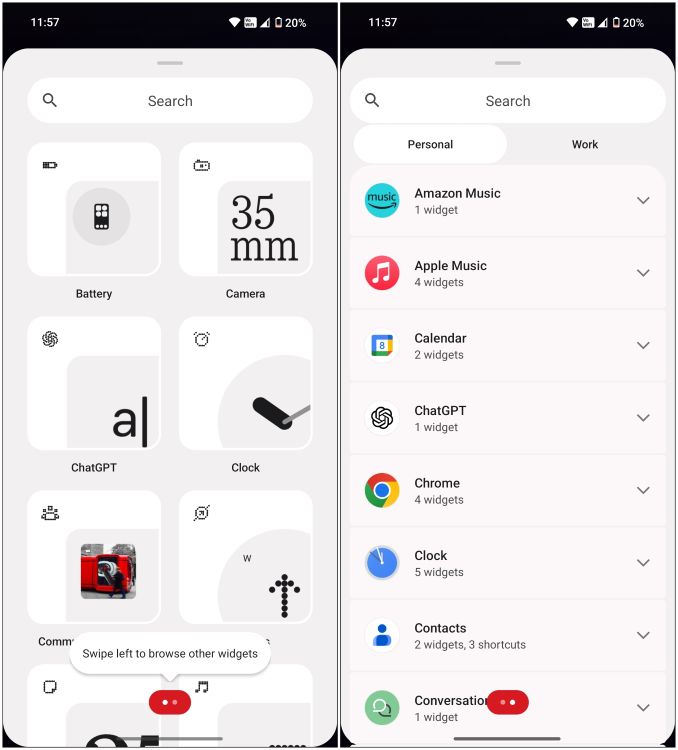
Talking about the widgets, some other changes that are supposed to come out with the new OS are the hourglass widget and widget sharing feature. Both of them were missing from the beta build I got my hands on, along with the new Nothing Gallery shown in the Nothing OS 3.0 reveal video.
The Always on display is also dimmer now compared to the previous version. This helps to save battery and is easier on the eyes at night. Then there are the new Android 15 features like partial screen recording, which lets you only record a single app. And the new predictive back gesture that only works on certain apps.
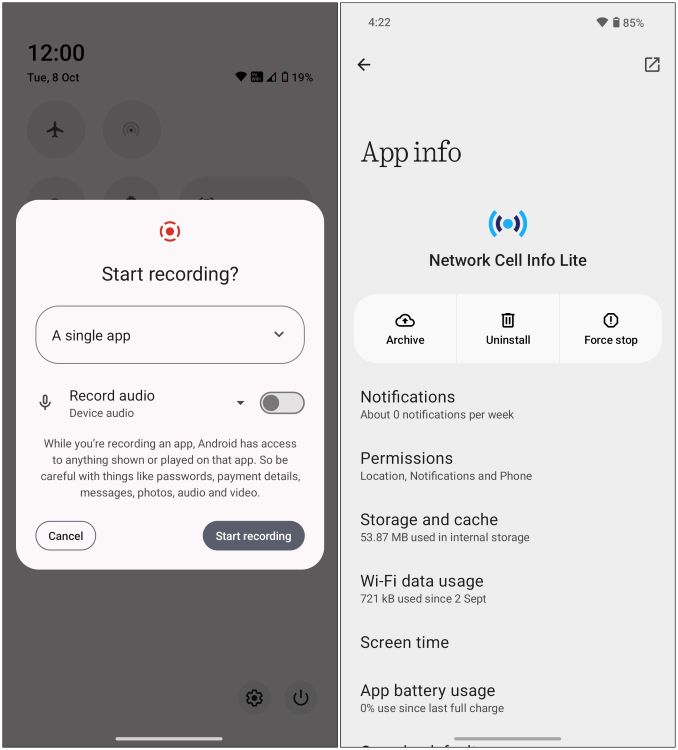
App archiving is also present here which we have covered in detail, but allows you to uninstall only the APK package of the app, retaining your data and login information. It’s similar to the app offloading option in iOS. However, Private Space is still missing as of now.
Nothing OS 3.0 Hands-On: A Fresh Coat of Paint
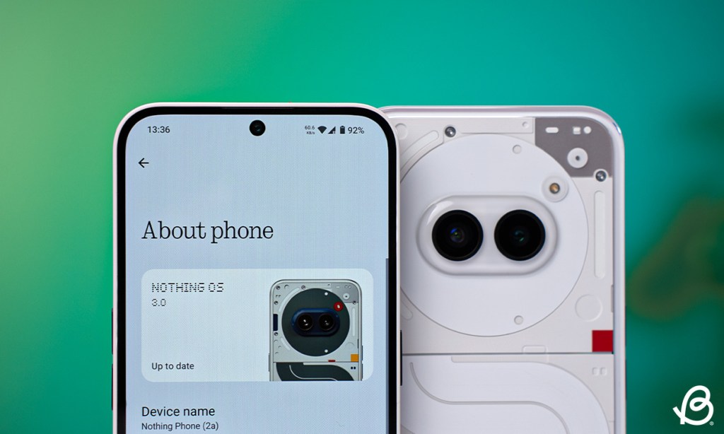
Even in the beta stage, my hands-on experience with the Nothing OS 3.0 was quite good. I installed all my favorite apps and didn’t run into any issues once. The performance of the device didn’t seem to be affected, and the same goes for the battery life. If anything I’d say it has only improved as the phone went from 60% to 30% during my half a day of setting up the devices and installing my favorite apps which drain the most battery. Still, the phone held up pretty well.
In verdict, I would like to draw some parallels from OxygenOS’ evolution, which also stuck to stock Android in its initial years before finding its own identity later down the line. I feel this update indicates that Nothing is going through the same journey. Nothing OS is maturing as an OS, departing from its vanilla Android look to offer something exclusive to their users.
I am pretty hopeful about these new changes, and I am sure enthusiasts and community members will also be as stoked as I am for this new release. Let us know your thoughts about this hands-on and about Nothing OS 3.0 in general in the comments below.
Marvel’s Thunderbolts Cast And Characters
James Gunn’s Creature Commandos Gets An R-Rated Official Trailer
Top 5 Topaz & Numby Teams In Honkai Star Rail (Ranked)


