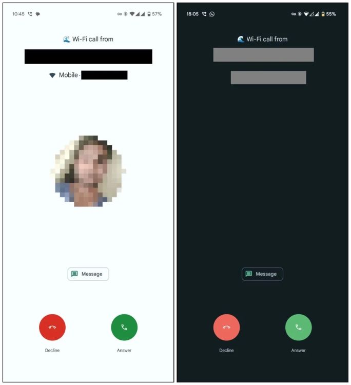
Android manufacturers taking inspiration from iOS isn’t anything new. Take the example of Xiaomi, Vivo, and even OnePlus. But it looks like Google itself is now taking design cues from the Cupertino giant. An APK teardown of the Google Phone app reveals a redesign that looks similar to iOS.
According to Android Authority, the search giant is testing a fresh new incoming call interface that matches the current iOS call screen. As you can see below, the new interface features two options to pick up or decline incoming calls.

Currently, you can swipe up to accept, or swipe down to decline the call on Google’s Phone app. Now, this two-button layout is adopted by other Android manufacturers, but what brings it closer to iOS is the placement of the buttons. The decline button is located to the left and the accept button is on the right, exactly how it is on Android.
At the moment, Google’s Phone app has a pretty minimal interface. However, the company may be adding these changes to cater to iOS users shifting to Android, offering a familiar experience to them. There is no official word from Google on this change. It is also currently unknown when will we get to see this feature come to our devices.
I for once like this change, as the current UI has gotten pretty dull for me. And if we are taking cues from Apple, why shy away from adding custom call backgrounds as well? What are your thoughts about these changes? Do you like the new iOS call screen redesign for the Google Phone app, or prefer the current one? Let us know in the comment section below.
How To Copy And Paste On Chromebook
Dune Prophecy Cast And Characters
How To Use Advanced Search On X (Twitter)

