Xiaomi announced HyperOS for its devices almost about a year ago, replacing its iconic MIUI. Now that they have begun testing the next version of their Android skin on a limited number of devices, we felt it was the perfect moment to compile a wishlist of features we’d want to see in HyperOS 2.0 and talk about areas where Xiaomi can improve.
HyperOS 2.0: Potential Release Date
Hyper OS 2.0 is in early testing in China on Xiaomi 14 and 14 Pro. These tests will iron out any major issues before the public rollout begins. Since Xiaomi released HyperOS in October last year, the next version should come out sometime around October this year, along with the Xiaomi 15 series. There’s also a likelihood of an earlier release since Android 15 is expected to come out in August alongside Google’s Pixel 9 series.
In terms of rollout, we can expect the update to first be available for last year’s flagship phones (Xiaomi 14 series) followed by other Mi, Redmi, and POCO devices later down the line. The wider rollout of HyperOS 2.0 for midrange and budget devices could start in 2025, but there is no particular timeline for it, and it might be delayed as well.
HyperOS 2.0: Confirmed Features
Apart from our wishlist, there are some confirmed features that we will get to see in HyperOS 2.0. Let us take a quick look at them.
- New Super Wallpapers
- Enhanced animation engine for improved animations.
- Revamped camera UI to easily switch between modes.
- HyperMind 2.0 features to switch balance and battery life.
- Group notifications from the same source.
- Redesigned control center, possibly based on iOS.
- Personalized messages in Always on Display, like on iOS.
HyperOS 2.0: Features We Wish to See
We are not including features that are coming with Android 15 like app archives, notification cooldown, and Private space. That’s because HyperOS will come with Android 15 for several devices, and these features are likely to come anyway in some way or another. With that said, let’s check out the list below.
1. Icon Theming and Customizations
MIUI and now HyperOS have offered pretty restricted customizations when it comes to icons. You can only change their size, and hide labels. So, now that iOS 18 is going heavy on icon customization with colored theming, and a dark mode, Xiaomi should also implement the same on their UI. Especially how closely they copy iOS, anyway.
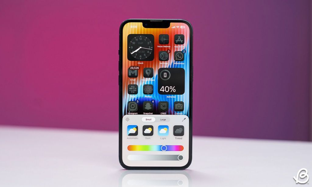
A bonus would be to change the icon shape, which I doubt they will provide, but what’s the harm in wishing?
2. Update Stock App Icons
Since MIUI 10, we’ve seen similar app icons with minimal design changes, even after HyperOS came out. It doesn’t look quite appealing and honestly outdated in 2024. I’m not suggesting going all Google and using flat icons, but Xiaomi can do better for its stock apps to help them stand out.
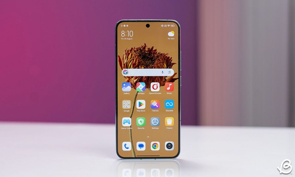
A good example would be HyperOS’ own stock Calculator app, which looks modern compared to the rest of the bunch.
3. Adopt Material You
For some reason, Xiaomi is adamant about adopting Material You system-wide theming even though it has been years since it came out. Every other Android skin, be it One UI or FuntouchOS has implemented it already. So it’s high time we finally get to see it in HyperOS with the next version. At least colored accents like ColorOS will also suffice.
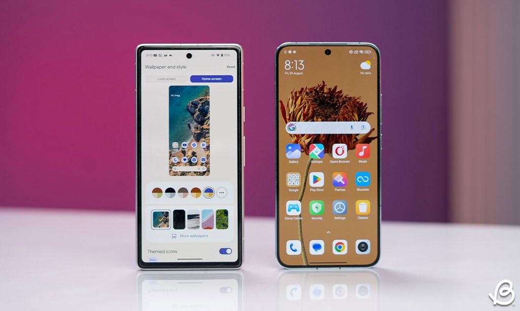
4. Revamped Interface and Settings
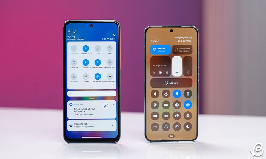
Even after the shift from MIUI to HyperOS, the base interface remained pretty much identical as it was. In fact, I have added screenshots of MIUI 12, and the latest version of HyperOS and you can see, between the years, there have been only a few changes.
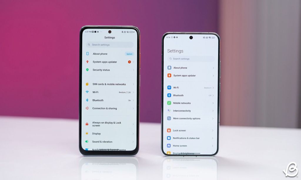
Xiaomi should redesign and bring improvements to its UI. The settings are also pretty cluttered, and a lot of options are hidden so deep that you can’t find them without looking them up on search. A better-organized and revamped layout for the settings can make HyperOS a lot more user-friendly.
5. Bring Back Old Control Centre
With the release of HyperOS, Xiaomi fully committed to the new iOS style control center with a separate page for notifications and quick toggles. Now there are people out there who prefer this style, I only wish they would bring back the option to switch back to the merged control center that we see on every other Android phone.
6. Detailed Battery Stats and Health Monitoring
HyperOS 2 should also include a more detailed battery page. Currently, you can’t check the screen on time, last charge percentage, and usage time since the last charge. These are important metrics to help a user learn about their smartphone usage habits and their phone’s battery.
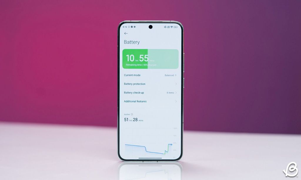
Plus, they should also let the user check the phone’s battery health, as the brand ships their devices with superfast charging bricks. Topping up the phone with these chargers can result in accelerated degradation in battery health, so the option to monitor it would be more than welcome.
7. Status Bar Customization
Another area where we would love to see further attention is the status bar. The upcoming HyperOS should include options to show or hide certain status bar icons, as you can do with OxygenOS. This can help keep the status bar clean and make room for notification icons and other indicators.
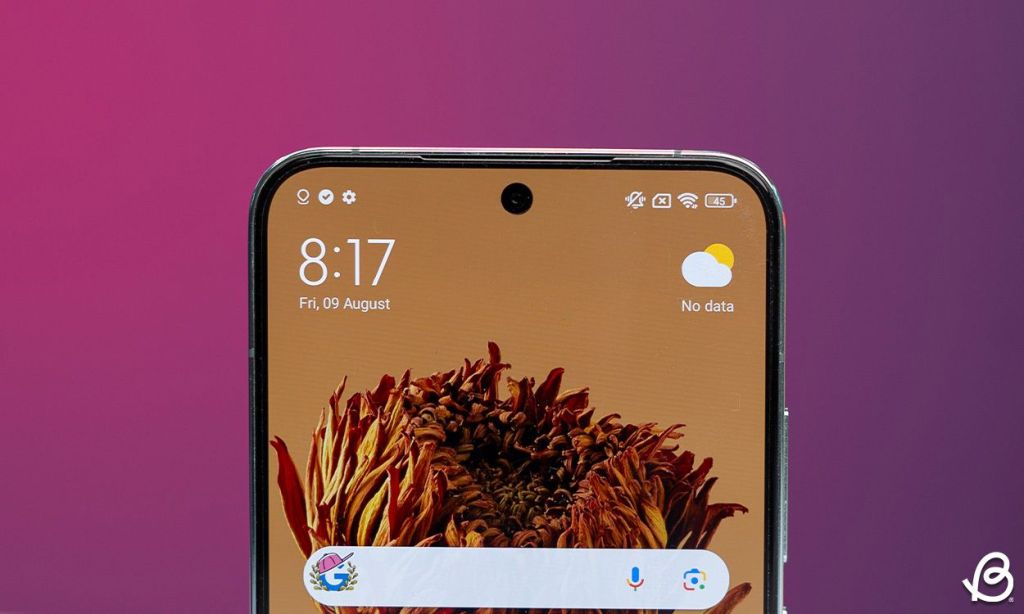
They could also add more battery styles to make it easy to check your current battery level at a glance. I know we can add battery percentage, but it is not as visually enticing as a circular or more rounded battery icon.
8. Lock Screen Widgets
If we are taking inspiration from iOS, then why did HyperOS leave out lock screen widgets? They are arguably the best aspect of current iOS experience. We already have customizable lock screen setups, so having a few widgets and quick app shortcuts would be amazing.
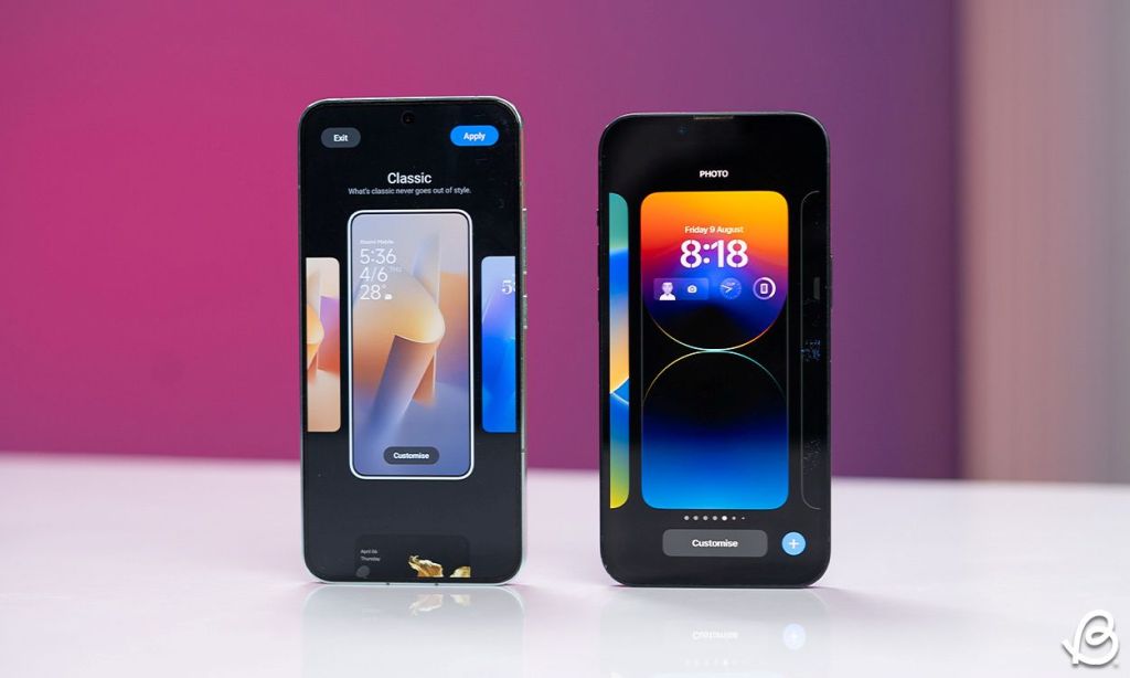
I often make online QR code payments, and having the payment scanner right from the lock screen to jump into it directly, rather than unlocking the phone, opening the app, and launching the scanner will serve as a major convenience for me and a lot of people.
Why HyperOS Should Have Its Own Identity
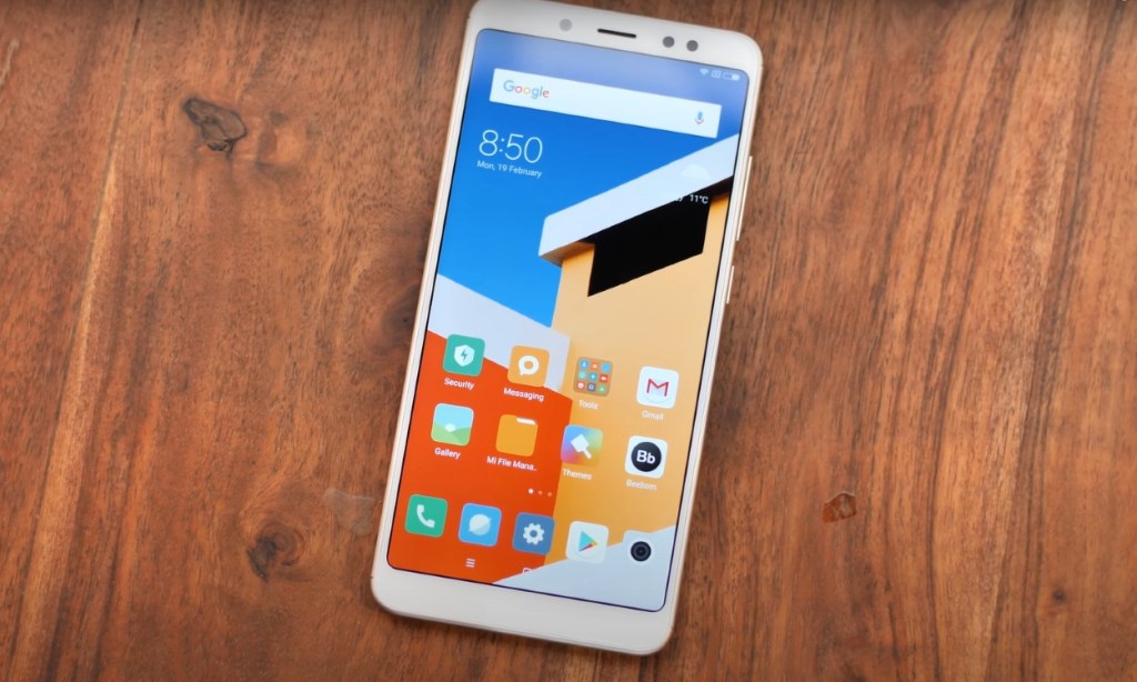
MIUI 14 in its later stages looked like a bizarre rendition of Apple’s iOS with little to no identity left of its own. There was a time when MIUI was so unique that people would install it on their phones just to experience it. It had a distinct style that I and many others adored. But for some reason, the UI gradually evolved into this.
HyperOS was intended to address this, however it simply reinforced it with a customizable lock screen UI. I know creating something unique is easier said than done, but I would like the OS to return to its former glory. Or at least not stick so closely to iOS and try new things and experiments. Are you excited about HyperOS 2.0, and which feature would you like Xiaomi to add? Let us know in the comments below.
What Is Depth Strider In Minecraft?
RCS On IOS 18 Not Working? Try These Fixes
How To Join Apple Intelligence Waitlist And What’s The Waitlist Time


