Earlier this week, we got a close look at Nothing OS 3.0, and as expected, it brought several changes and new features to the UI that are rare to see in software updates. But during my hands-on with the operating system, certain features didn’t scratch the itch I was looking for, leaving a few things to be desired. That’s why I created this list of all the minor changes I would like to see in Nothing OS 3.0 before the update officially rolls out.
1. New Placement for Pinned App
Typically, you can turn on app suggestions in the app drawer which shows your most or frequently used apps at the top. But these suggestions hardly get things right. To fix that, Nothing has added a simple yet smart solution instead, allowing you to manually pin your favorite apps to the top of the page. I loved this feature and even raved about it in my Nothing OS 3.0 hands-on impressions.
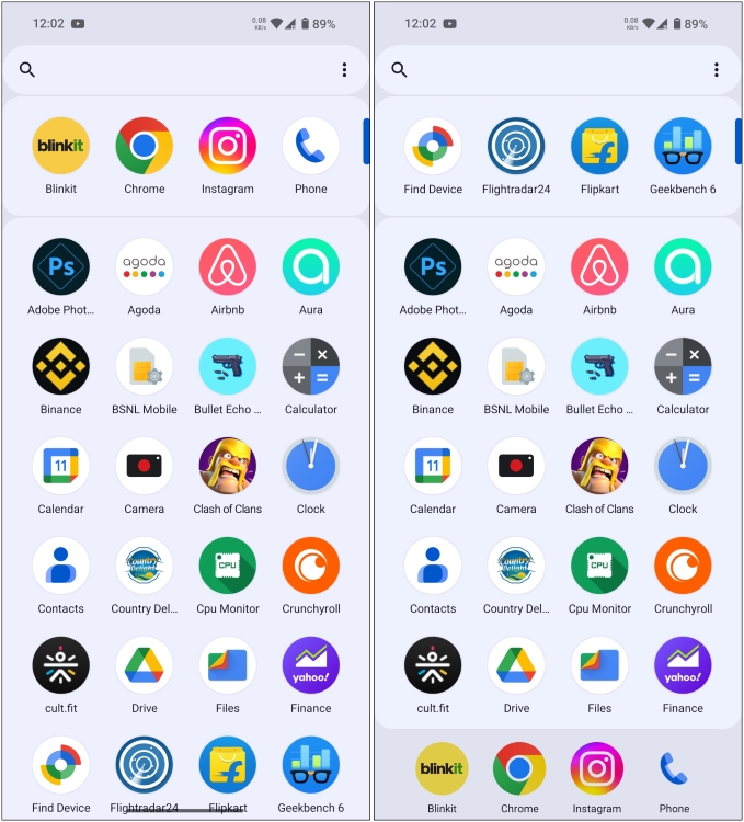
However, after speaking to a couple of my friends I realized if I am pinning my apps, then wouldn’t it be better if I could have access to them at all times while scrolling through the drawer? I feel that the pinned apps should be sticky and shown at the bottom of the carousel. I mean think of it, if those are the apps I want to reach first, they should be constantly visible, right? So, this is my first suggestion to improve the app drawer.
2. Brightness Slider in Collapsed View
The entire quick settings panel has received a facelift with Nothing OS 3.0 along with the brightness slider, which has grown thicker and moved to the bottom of the panel. This is a good position for it, as I can now reach the slider with one hand without having to stretch my finger to the top.
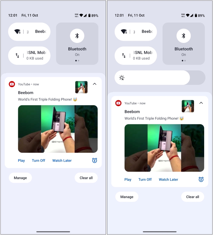
However, you need to fully expand the quick settings by swiping down twice from the top to access the brightness slider. Something that is used so often should be available in one swipe. Therefore, Nothing should bring the brightness slider to the collapsed panel making it more accessible to the user. So Nothing OS software team, I humbly request you to make the brightness slider available with one swipe.
3. Change Clock Face and Widget Colors
Lockscreen customizations are also part of the new update, allowing you to swap clock faces or add more widgets. And I am already a fan of these new designs for the clock. But why everything’s gotta be so black and white? I switch wallpapers now and then, and while monochrome has its charm, I also like a dash of color from time to time.
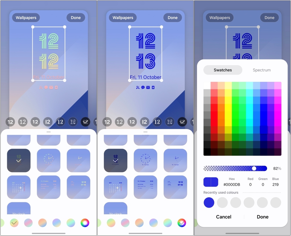
Samsung’s One UI already lets you pick a color for the lockscreen clock face and notifications, so a custom color picker would be a great addition. Given how unique these new clock face designs are, changing their colors would help them pop out against the background.
I am not asking much, just let us change the colors of all the B&W elements in the lock screen like the clock faces and the elements in the widgets.
4. Changes to Smart Drawer
Smart Drawer is another new feature that automatically sorts all your apps into different category folders. If you have used iOS, then you know this feature is almost identical to its App Library. I’m in the group of people who like this feature, but one thing that’s stopping me from using it as my default is its limited customization.
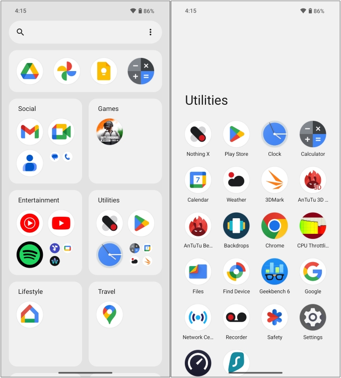
I cannot rearrange these folders, so what’s at the top stays at the top. I can neither move apps from one folder to another nor create new folders myself. So now I have two email apps, in two separate folders and I cannot do anything about it. That is why I would request the folks at Nothing to open up some customization options for this new “Smart” app drawer.
5. Let Users Choose the Font
Last but not the least is the matter of the N-dot font. With Nothing OS 3.0, the London-based tech company has removed its iconic font from the UI. The reason for this is better readability and I get it. The new Sans Serif font is for sure an improvement over the last one.
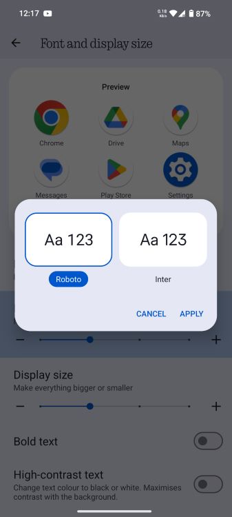
But Nothing fans do miss the dotted font, as expressed by some members on the official community website and on Reddit. So, how about an option to toggle between the old and new fonts? An option to jump between the two will make everyone happy. There is already a similar option in the settings to change the default fonts so why not do something like this for all the N-dot lovers out there?
6. Widget Stacks
Another feature that I have enjoyed a lot on Samsung’s One UI and would love for it to come over to Nothing OS is widget stacks. I don’t think I would be wrong in saying that the widgets are one of the highlights of Nothing OS, and we are soon getting a new hourglass widget to the mix.
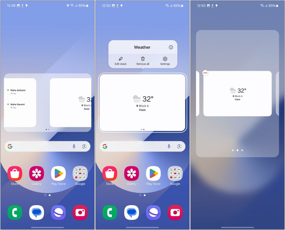
And even though I would love to drown out my homescreen with only widgets, that can’t be the case. Then how about an option where I can stack widgets on top of one another, accommodating more widgets and making room for essential apps, while still allowing me to get information at a glance? I know this feature will translate quite well for Nothing devices.
So these are all the minor changes I hope to see in the final release of Nothing’s upcoming software release. Some of these changes are my personal opinions, while others are suggested by my Editors and ideas taken from community forums.
Do let us know what you think about this list, and are there any features that we missed that you wanted to see in Nothing OS 3.0? Let us know in the comment section below.
NYT Connections Today: Hints And Answers For October 21, 2024
How To Know If Someone Blocked You On Instagram
Anime Dimensions Codes (October 2024)


