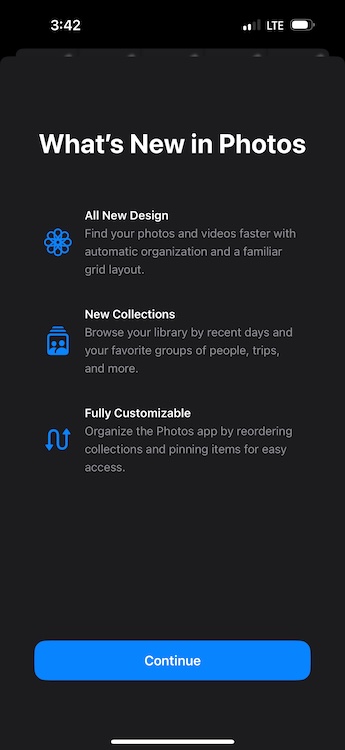
The stable version of iOS 18 is finally here! The latest iOS brings an array of new features, customizations, and improvements, which makes it the biggest iPhone software update ever. While iOS 18 packs a punch with some cool customization options, some weird changes hit really hard, especially if you’ve been using an iPhone for quite a long time. For me, it’s the ‘redesigned’ Photos app. When Apple first previewed iOS 18 at WWDC 2024 in June, it mentioned that the Photos app got “the biggest-ever redesign” which makes searching for photos much easier and quicker.
While Apple thinks the redesigned Photos app offers a lot of convenience, I feel it’s more complicated and overwhelming. At first, I thought it was only me who hated the new design of the Photos app, but now I know I’m not alone in my disappointment. Several Reddit users have been fuming about Apple’s decision.
Changes in the Photos App in iOS 18

The Photos app in iOS 18 features Collections which automatically organizes your entire photo library by themes like Recent Days, Memories, Trips, People & Pets, and more. When you first open the Photos app in iOS 18, you’ll immediately notice and miss the absence of separate tabs. Rather, you’ll see the main Photo Library grid that shows about 30 images at once.
Various sections of the photo library are framed into a single, scrollable view. Also, the images previously shown in the “For You” section are now shown under different collections. You must scroll down to enter the full Photo Library view. You can then zoom in or out to see more or fewer images at once. The new layout has the Years and Months options to browse your photo history. However, the Days option has now been replaced by the Recent Days Collection.
The New Design Kills Simplicity
The moment I opened the Photos app in iOS 18, I instantly missed the clean interface with separate tabs that used to reside at the bottom of the screen. Apple has ditched the tabbed navigation bar at the bottom in favor of a new scrolling design, which I feel makes the app slower, cluttered, and confusing. Rather than tabs, you’ll find collections that are automatically categorized by themes. I find it unnecessarily complicated to browse through so many automated collections, waiting for your attention. The old Photos app already had some themes and categories, but the iOS 18 Photos app shows all the photos on a single scrollable page. Honestly, it makes searching for photos more difficult.
Maybe I’m too used to the old version, but I really liked it when all my photos were in one place. Now, different images on my iPhone are saved in different folders. I often download images from WhatsApp, and I can easily access them via the All Photos tab in the older version. Now, my downloaded images automatically go to the Recently Saved collection. Also, different sections like Favorites and Utilities are buried inside that laborious scrollable page under “smart” memories. Every time I wish to find a photo, I have to dig in and find the appropriate collection first. And, I still haven’t developed a muscle memory for this. So, I aggressively scroll and swipe everywhere I can.
Apart from the stupid navigation and confusing design, the new version of the Photos app also changed the way how I used to view and edit videos on my iPhone. If I had to play a video in full screen on iOS 17 or earlier, I just have to tap on it. However, that’s not the case with iOS 18. When I tap on a video once, it won’t play in full-screen. I have to tap it again to make it full-screen. That’s not all. Also, video thumbnails aren’t the same anymore. The video previews in the iOS 18 Photos app don’t show timestamps. This makes it difficult to crop videos at a specific time.
All in all, the new layout of the Photos app feels far less intuitive and user-friendly. It has killed the simplicity that I was used to, being an iPhone user for more than a decade now. For me, the iOS 18 Photos app isn’t an upgrade, it’s a complete mess.
Some Customizations Are My Savior
While I miss the old design, there are a few customization options that make the iOS 18 Photos app bearable for me. If you also miss the old version of the iPhone Photos app, you’ll also find these customizations useful.
Hide or Change Collections for a Personalized experience
If there’s one thing that Apple did right with the iOS 18 Photos app it’s giving users the ability to customize it. Otherwise, I would be stuck with this complicated layout. To make my photo library easy to navigate, I have hidden some collections that I don’t need and even changed their order. Here’s what I did:
- Open the Photos app, scroll down to the bottom, and tap on Customise & Reorder.
- On the next screen, you can hide the collections you don’t need or reorder them for a personalized view.
- Simply uncheck the collections you wish to hide.
- To reorder the collections, simply tap and hold a collection to move it. I like keeping the ‘Albums’ and ‘Recent Days’ collections at the top.

- Also, I don’t need Maps in the Pinned Collections. So, I have removed it and added the Selfies folder instead.

Hide Screenshots from Photos Gallery
Due to my work, I often take a lot of screenshots on my iPhone. Therefore, my photo library is overrun with screenshots and also I don’t wish to delete them. Thankfully, I can hide screenshots from my photo feed and restrict them to the dedicated Screenshots folder under Pinned Collections. Here’s how I do it:
- Open the Photos app on your iPhone.
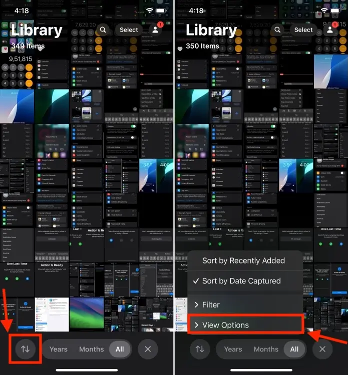
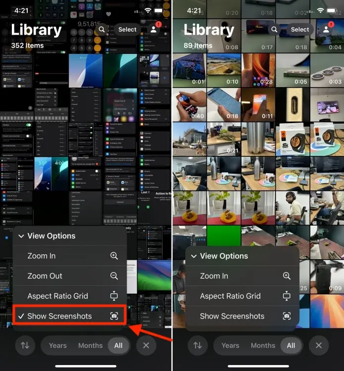
- As you start scrolling the photos library, you’ll find a new icon (an up and a down arrow) at the bottom. Tap on it and select View Options.

- Now, uncheck the Show Screenshots option. This will instantly hide all the screenshots on your iPhone.

- You can find all your screenshots in the Screenshots folder under Pinned Collections.
While this won’t bring back the nostalgia and simplicity of the old Photos app, these customizations should at least make the Photos app less complicated and confusing than it first appears. Of course, you will still have to relearn some muscle memory.
The new layout might not be a bad change, but it is unnecessarily complicated and users will definitely need time to adapt to this. I’m waiting to see how the iOS 18 Photos app will work with Apple Intelligence. After all, Apple touted they’ve redesigned the app so it works seamlessly with the AI system. I hope the upcoming AI features will make it easier to find and edit photos, so this ‘redesigned’ Photos app doesn’t feel that bad. Again, not all iPhones will get the Apple Intelligence support. If you’ve got a compatible model, you’re in luck.
Do you also miss the old Photos app like me? Or, do you like the iOS 18 Photos app? I’d love to hear from you in the comments below.
Today’s Wordle Answer And Hints (October 10, 2024)
Chromebook Not Turning On? Here’s How You Can Fix It
Roblox Pls Donate Codes (October 2024)


